Thursday 23 October 2014

Playing Cards: Final

I ended up making all 54 cards, which I won't post here as that would be some excessive scrolling!  All my character cards are shown above, and the number cards look like the one below.


The back of the cards


Playing Cards: Joker

While designing my cards I ran into some issues with the placement of the text on my Joker design.

Traditionally Joker cards are illustrated with a Jester, so this makes identification in common decks simple.  However this  becomes more difficult in a deck which doesn't follow these rules.   Because of this I decided to have a bit of a closer look at Joker cards and how they differ from the rest of the pack.

Joker cards sometimes stand out from the rest of the pack.  In many cases they are brighter coloured, feature a full body rather than a mirrored torso like the common character cards.  They also do not belong to any suit or have any assigned letter or symbol.  "Some early Jokers were specially designed, along with special Aces of Spades, as part of the company's brand identity. " (para.3, http://www.wopc.co.uk/jokers/index.html)


In my research I wanted to see if there was a common symbol that was used to represent the Joker.  I found that while there wasn't any consistent symbol across decks many used stars/ pentacles or placed each of the suits in the corners of the card.

The earliest example I could find of the stars on the Joker card is the one in the image below.

Figure 1: Early non-standard Joker and Ace of Spades by The London Playing Card Co. (alias Goodall) for Sanderson Bros & Newbould Ltd, c.1912.  Retrieved from http://www.wopc.co.uk/jokers/jokers2.html

Most commonly, Joker cards are simply indicated through the text JOKER placed somewhere on the card, although sometimes a stylised J is used.  This however can be confusing when you considered that Jacks are also represented with the letter J.


To summarize, this research didn't really help a lot, as I feel no desire to add a jesters cap to my rook.  So I simply made a few variations of the joker card to choose from.

Figure 2:  Joker Variations

I feel that the 2nd row, 3rd across is the best design to use.  With this placement the text can be easily read whichever way up the card is, but also doesn't conflict by crossing over the black and white areas.

Playing Cards: My Designs

These cards will be using simplified chess pieces, in black and white.  To get a nice, clean look to these cards I will be using a combination of Photoshop and Inkscape to create these designs.

Chess pieces will be drawn in Photoshop, before being brought into Inkscape to create vectors and clean up messy edges. 

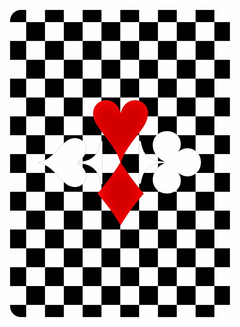
I started out by looking at the King of Hearts to try to get my overall design style locked down.  I had previously decided to stick with my original idea of using a very limited colour palette of Black, White and Red, which would work well with the clean lines of the vectors.  

Figure 1: Design Variations and Development
I started out with a slimmer King Piece and thought to replace the cross on the crown of the King with it's respective suit.  This caused problems with shape of the King actually being read, as the slimmer shape and absence of the cross made it look like a Queen.  I drew another King based on a different chess set and decided to keep the cross as a cross so not to confuse things.  I wanted the black and white pieces of the chess set to carry through onto the cards so I experimented with subtle variations of white on black, black on white and black on black.

Adding basic detailing to the King, rather than using silhouettes really made the design pop, and somehow made the whole design look more polished.

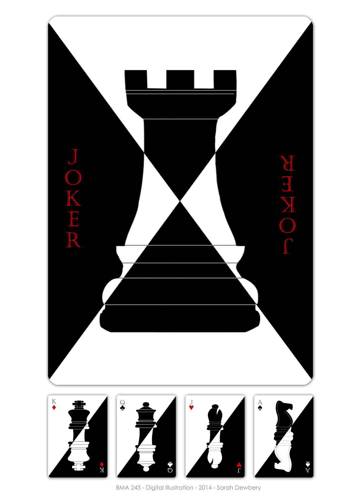
I plan to follow the design of the bottom right card for the rest of the pack.
Queen's = Queens.  Jacks= Bishops.  Ace= Knights.  Rooks = Jokers.  Number cards= Pawns.

For the Joker I think it would be neat to create a slightly different design- perhaps with the card split into black and white on both diagonals- like a combination of the card viewed both way's up.  This will reflect the wild card status often associated with Joker Cards.

For the pawns I think reflecting them across the black and white in the same way would be too much for a basic number card, so could present these with the number of pawns representing the number of the card, or simplify the design by showing only one on each card but with the number on it.              

Playing Card: My Ideas and Research

One of my ideas I had while brainstorming was to match chess pieces to their respective playing card.  That both games used Kings and Queens, and how the other pieces would match up was something I had thought about as a child.  I thought this idea would suit a clean, simplified style  

I had the feeling that this concept would probably have already been explored so I did some research online and found the three following designs. 

Icelandic Chess playing cards by Alf Cooke
Figure 1: Icelandic Chess playing cards. Alf Cooke. 1942. retrieved from http://www.wopc.co.uk/alfcooke/chess.html

http://www.playingcards.me.uk/playcard/ita/images/ita049.jpg
Figure 2: Chess Playing Cards (Italy). n.d. Retrieved from http://www.hgimages.dircon.co.uk/playcard/ita/catita.htm
Figure 3: Chess Themed Playing Cards. Oscar Chea. 2013. Retrieved from https://www.behance.net/gallery/7412287/Chess-Theme-Playing-Cards


Another idea was to create a nursery rhyme themed pack.  I had thought first that there were so many nursery rhymes with kings and queens and jacks that I could use these for inspiration and draw characters based off them.  For example there are rhymes about Jack- who jumped the candle stick, or who ate pudding pie in a corner; or the Queen eating bread and honey.  Or even:
The Queen of Hearts
She made some tarts,
    All on a summer's day;
The Knave of Hearts
He stole those tarts,
    And took them clean away.
The King of Hearts
Called for the tarts,
    And beat the knave full sore;
The Knave of Hearts
Brought back the tarts,
    And vowed he'd steal no more

I found that the nursery rhyme idea was popular amongst other designers with many such decks already existing, although seen more often in old maid decks.
Mother Goose Nursery Rhyme Card Deck I
Figure 4: Mother Goose Cards. n.d. retrieved from http://www.blackdogaccessories.com/card_games_main18.htm


Vintage Old Maid Children's Playing Cards with Adorable Storybook and Nursery Rhyme Characters Includes Little Black Sambo Set of 18
Figure 5: Old Maid. n.d. Retrieved from https://www.etsy.com/nz/listing/190971689/vintage-old-maid-childrens-playing-cards?ref=related-3


Vintage Children's Old Maid Playing Cards with Adorable Mother Goose Nursery Rhyme Characters Set of 19
Figure 6: Old Maid Cards. n.d. Retrieved from https://www.etsy.com/nz/listing/201850641/vintage-childrens-old-maid-playing-cards?ref=related-5


The third idea I chose to research was the Animal deck idea- where each suit would be represented by a different animal eg cats, dogs, birds, and rodents or maybe reptiles.
I found a couple of decks with animal themes but neither of these examples use the suit set up. In the WWF cards the different suits seem to relate to different habitats

cards lo
Figure 7: WWF Animal Kingdom cards.  n.d. Retrieved from http://juliakuo.com/my-work/animal-kingdom-playing-cards/


During my research I also came across this awesome inverted colour deck


Figure 8: Black Tiger Playing Cards. Ellusionist. n.d. Retrieved from http://www.kardify.com/2014/05/deck-view-black-tiger-playing-cards.html


Playing Card: History and Designs

I decided a good place to start before going too deep into my own design ideas was to research the playing card's history and some of the existing designs.

Playing cards possibly arrived in Europe in around 1350 ("A Brief History of Playing Cards", n.d., para.4), with the English pattern of playing cards evolving from a 15th century design which originated in Rouen, France ("A Brief History of Playing Cards", n.d., para.2).

With this long history it stands to reason that the playing card has undergone many changes in both design and interpretation.  Some believe that represented the world, "The 52-card pack with four suit signs and a hierarchy of court cards was an allusion to the late medieval world: four seasons, four cardinal points, four elements, 52 weeks in the year" ("The World of Playing Cards", n.d., para.1)

The suit's have also gone through a number of changes.    The Suit's seen on the cards we play with come from the French designs, however over time and in different countries suit's have greatly varied.   In some cases they were different coins, in others were represented by Swords, Sticks, Cups and Coins.  In the late 14th century other suits also emerged in different countries: The ‘Latin Suits’ of Swords, Batons, Cups and Coin,  German and  Swiss's Hearts, Bells, Leaves and Acorns, and the  Hearts, Clubs, Spades and Diamonds in the French Designs ("A Brief History of Playing Cards", n.d.)

Modern designs have sometimes seen these suits being replaced with ones to fit with the designers chosen themeCard design collaborations, or even new designs by individual designers seem to appear quite often.  

A recent project I came across was Creative Cards- a collaboration of 54 people to create a full deck of cards.  These is an amazing project to look at as it showcases such a variety of styles.  I really like the clean lines of Nate Coonrod's design and the black on black of Micheal Molloy's Queen of Spades.  These designs are a bit more detailed then a simplified style I am considering if I go with the chess piece idea, but are really nice inspiration of a slightly different direction I could take the design in.

Figure 1: Jack of Diamonds. N, Conrod. 2013. Retrieved from http://creativecards.cc/nate-coonrod/

  
Figure 2: Queen of Spades. M, Molloy. 2013. Retrieved from http://creativecards.cc/michael-molloy/
A couple of other images I really liked are Raphael Vicenzi's 3 of Spades- with has a really nice loose feel to it (I had thought about doing something with a hand-drawn look to it), and Matai Apostolescu's 6 of Diamonds.


Figure 3: 3 of Spades. R,Vicenzi. 2013. Retrieved from http://creativecards.cc/raphael-vicenzi/

Figure 4: 6 of Diamonds. M, Apostolescu. 2013. Retrieved from http://creativecards.cc/matei-apostolescu/

There are so many creative decks out there it is impossible to show all the ones I like here, but there are also some awesome designs compiled here: http://www.creativebloq.com/design/custom-playing-cards-8133759


playing card designs
Figure 5: The Poop Deck. J, Burlinson. n.d.. Retrieved from http://www.creativebloq.com/design/custom-playing-cards-8133759


References:

Whiteknukle playing cards. (n.d.). Retrieved from http://whiteknucklecards.com/history/briefhistory.html

World of playing cards. (n.d.). Retrieved from http://www.wopc.co.uk/

Wednesday 22 October 2014

Playing Card Designs: Initial Brainstorm


Just an Initial brainstorm.  At the moment I like the Chess, Nursery Rhymes or Animal Theme ideas best.

Sci-Fi Landscape: Development and Final

Figure 1: Final Sci-Fi Environment

This is the final version of one of my Sci-fi environments.  I think I could have done more with it- tidied up the buildings and pushed the lighting a bit, however the deadline has now been and gone so this is as good as it is gonna get.  Unfortunately I ran out of time to work on my other landscape, so that might be a project for when I get some spare time. 

Here's some work in progress imagery:

Figure 2: Original Render

So the originally idea for this scene came from this original render.  I looked at the fake islands enclosed in a bubble and wondered what type of world something like this would exist in.  Of course- a dreary futuristic world where growing plants on the earth surface is no longer an option!


Figure 3: WIP 1
I wanted to emphasize this bubble so it would stand out from the sky.  Because of the idea behind this world the ground and sky would both be very smoggy.

Figure 4: WIP 2

Figure 5: WIP 3
The bubble would obviously need to be access through vehicle use, so I decided on little airstrips built onto the sides of watchtowers.

Figure 6: WIP 4