Tuesday 26 August 2014

Clock Creation


The other part of our first assignment is creating a clock design.


I approached this assignment by thinking about clocks, time and what it all means to me.

Figure 1: Brainstorm

Next I drew up some design roughs exploring some of these ideas. 

Figure 2: Design Roughs


I decided that I liked the night and day/ sun and moon themes better, and I also thought that these types of designs lent themselves to my earlier questions, what is time and does it really exist?

I decided to develop these concepts further.

Figure 3: Design Development


Of these designs I found that the hourglass and the knot appealed to me most.  I created a day and night scene to use on these designs.

Figure 4: Day

I used photos I took of the sky as reference for my cloud paintings, but I wanted them to have a stylised rather than realistic look.
Figure 5: Assorted Sky Reference


 For the night sky I used a combination of free creative commons star brushes and my own custom brushes.

Figure 6: Night


All of the sky and mis-shapen clocks reminded me of the work of both Rene Magritte and Salvador Dali two famous surrealist painters.  Dali's painting, "The Persistence of Memory" is very famous and today clocks are manufactured to look like the dropping clocks shown in this painting.   

Magritte is often associated with his use of the sky within his paintings.

Figure 7: The Persistence of Memory.  Salvador Dali. 1931.  Oil on Canvas.  24cm x33cm. Museum of Modern Art.
Figure 8: The Entrance. Rene Magritte. 1931. 20 x 28 inch. Retrieved from http://echostains.wordpress.com/2009/11/21/happy-birthday-rene-magritte/  


These artists could serve as extra inspiration for my designs.
Figure 9: Knot Clock Design
Further exploration of the knot concept lead to the above design.  I used the warp tool in Photoshop to manipulated my Day and Night imagery into the shape of the knot.  While I liked the design I wasn't sure that it was exactly what I was after.  I considered placing something in the middle of the design and experimented with sun and moon designs like the one below, but they made the piece look too cluttered.


Figure 10: Metal Sun design

I decided that the hourglass was a really interesting concept so worked on this design more.  Once again I used the warp tool on the day and night imagery to create the appearance that they were being sucked through the hourglass.  I wanted the design to be quite graphic and simple in its linework.  To create the effect of glass I applied a black hourglass shape over the skies and lowered the transparency.  I gave it a darker rim, like seen on glass containers and added some highlights.

Finally I added a subtle lens flair to the skies.  This is something I normally avoid as it can look very tacky but in this case I feel that it enhances the style.  


Figure 11: Final Clock Design

Comets, Wormholes and Planets

When creating the comets and other elements for my board game I looked at photos of comets as reference.

Figure 1: Comet. A. Block.  2013. Retrieved from http://www.space.com/20058-amazing-comet-photos-2013-stargazers.html

Figure 2: Comet Pan-STARRS.  L, Argerich. 2013. Retrieved from http://www.space.com/20058-amazing-comet-photos-2013-stargazers.html

I wanted the comets in my project to be very bright to stand out against the sky.  They are also shown as if seen from a distance. 

Figure 1: Designs for Snakes and Ladders
These elements were created for my Snakes and Ladders redesign.  The top three comets were made purely in photoshop using the smudge, liquify and glow tools.  Particle fall-off was applied with a gradient sent to dissolve.  The bottom comet was rendered from Maya and then manipulated in photoshop.  

The Blackholes/ Wormholes were also painted in Photoshop and use the glow fx.

As for the planet this was created from a concrete texture, which was Spherized in Photoshop and then shaded.

Figure 2: Final Snakes and Ladders redesign

Snakes and Ladders in Space

For my redesign of a Snakes and Ladders board I decided to explore a space theme.  Initially the idea was that players would travel towards the finish on comets and back down through blackholes.

Blackholes are technically invisible, and can only be seen through X-ray imagery.  For the purpose of my Snakes and Ladders board I am approaching from a more Sci-Fi perspective.  This also opens up the possibility of using wormholes rather than blackholes as this would fit in more closely with the travel aspect of the game.

Here are some images from the Hubble space telescope, showing some interesting areas of space.

Figure 1: Star Cluster. Sourced from "Space Telescope" by NASA. 2007. Photograph. 3885 x3904. Retrieved from http://www.spacetelescope.org/images/archive/top100

I was surprised by these photos, as I didn't expect real photos of space to be so fantastical.  These photos look like space scenes created in photoshop.
     
Figure 2: Stellar Nursery. Sourced from "Space Telescope" by NASA. 2007. Photograph. 5302 x 3805. Retrieved from http://www.spacetelescope.org/images/archive/top100
Figure 3: A Rose Made of Galaxies. Sourced from "Space Telescope" by NASA. 2011. Photograph. 5302 x 3805. Retrieved from http://www.spacetelescope.org/images/archive/top100
Figure 4: Magnetic Monster. Sourced from "Space Telescope" by NASA. 2008. Photograph. 4633 x 3590. Retrieved from http://www.spacetelescope.org/images/archive/top100

These filaments are suspended in a magnetic field which maintains their structure and demonstrates how energy from the central black hole is transferred to the surrounding gas.

Figure 5: Random Galaxies. Sourced from "Space Telescope" by NASA. 2004. Photograph. 6200 x 6200. Retrieved from http://www.spacetelescope.org/images/archive/top100
Figure 5 is more what I expected to see when I began researching space imagery, somewhat amazing but subdued in comparison to the other images.


Figure 6: Orion Nebula. Sourced from "Space Telescope" by NASA. 2006. Photograph. 18000 x 18000. Retrieved from http://www.spacetelescope.org/images/archive/top100
This Nebula is incredible.  I love the range of colours and think adding nebula to my board would enhance the sci-fi feel.

Figure 7: Starburst. Sourced from "Space Telescope" by NASA. 2006. Photograph. 7400 x 9500. Retrieved from http://www.spacetelescope.org/images/archive/top100

Figure 8: Raditation from Young Stars. Sourced from "Space Telescope" by NASA. 2005. Photograph. 3221 x 3761. Retrieved from http://www.spacetelescope.org/images/archive/top100

Another amazing image.  I like the scattering of tiny stars.


Thursday 7 August 2014

Snakes and Ladders: Research

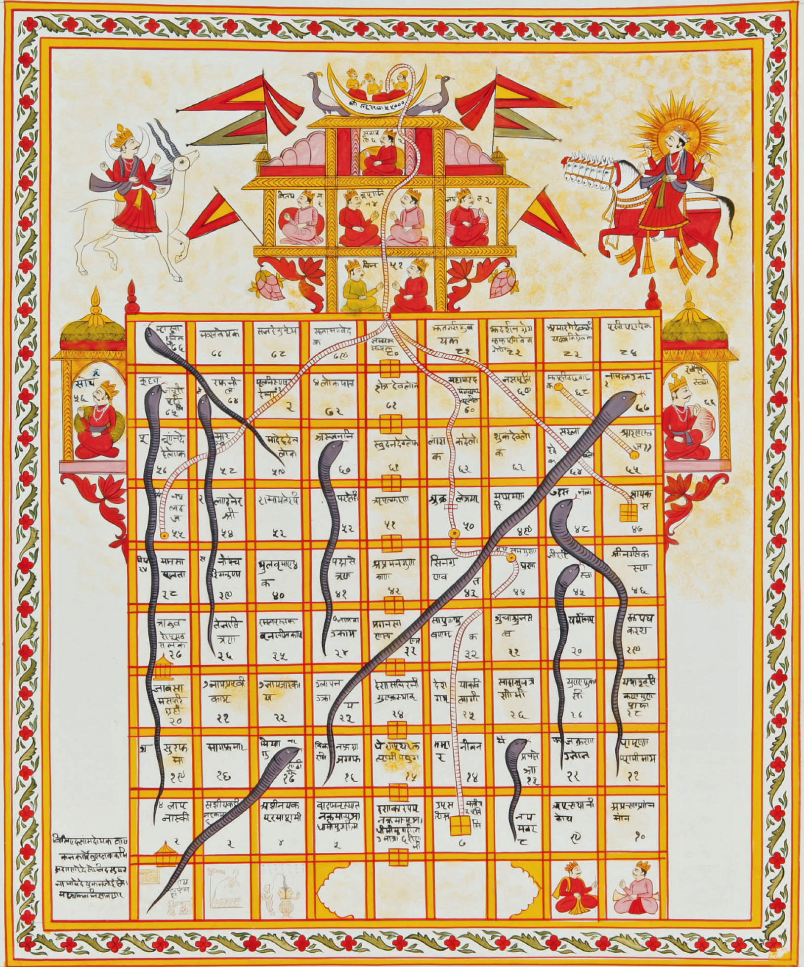
The board game Snakes and Ladders originated from Vaikuntapaali or Paramapada Sopanam (the ladder to salvation), a game from India based on morality.    It was often known as in Ancient India as Moksha Patamu. 

In this game the ladders represented virtues such as generosity, faith, and humility while the snakes represented vices such as lust, anger, murder and theft. The moral of the game was that a person can attain salvation through performing good deeds whereas by doing evil one takes rebirth in lower forms of life. The number of ladders was less than the number of snakes as a reminder that treading the path of good is very difficult compared to committing sins. Presumably the number "100" represented Moksha (Salvation).  (Snakes and Ladders, n.d.)

 Figure 1: Game of Snakes and Ladders, gouache on cloth (India, 19th century). Retrieved from wikipedia

A newer version of the game was introduced in England in 1892 and was later introduced to the United States by Milton Bradley in 1943.  Since then the game has become a classic, and has experienced many redesigns.

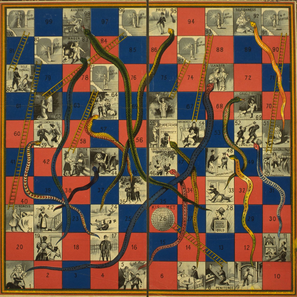
Figure 2: Page from a Kalpa Sutra manuscript showing the birth of Mahavira.  about 1450-1500.  opaque watercolour and gold paint on paper, Victoria and Albert Museum, London. Retrieved from www.vam.ac.uk.

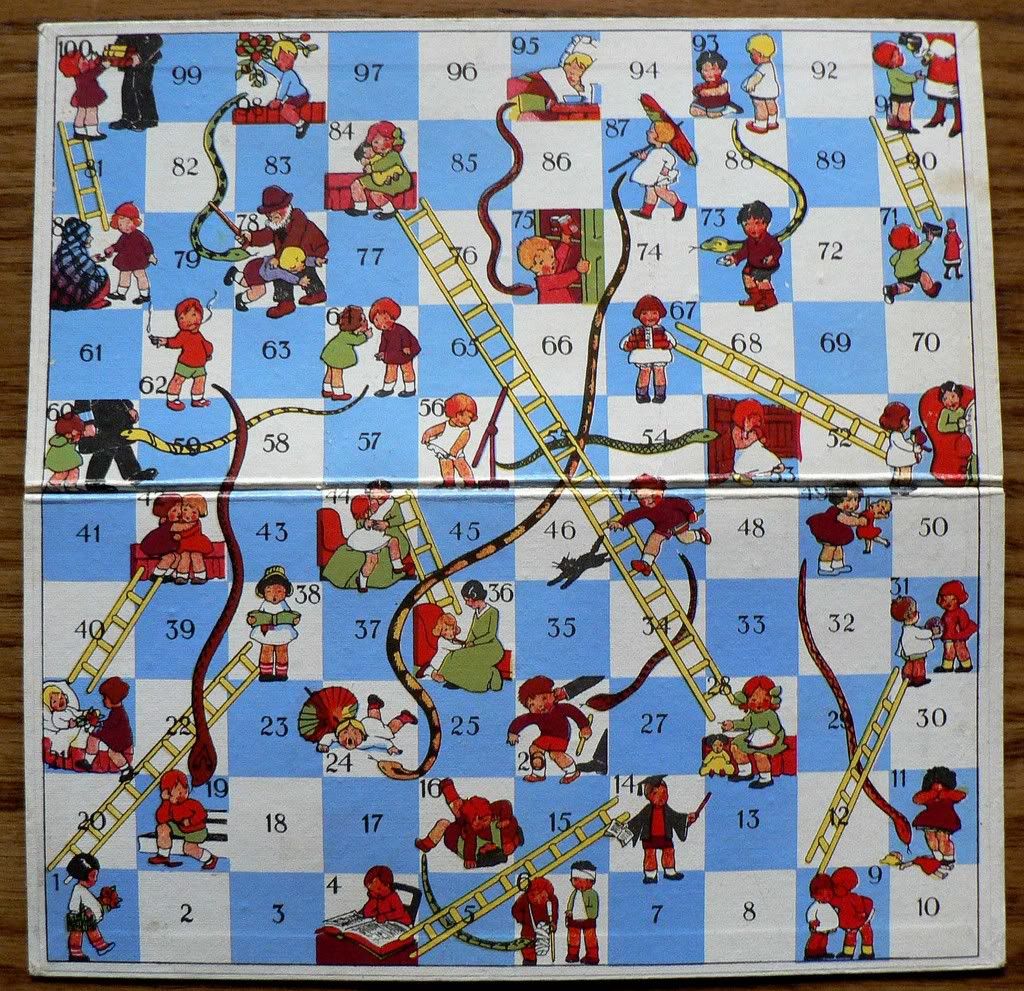
I like the checkerboard style and colours of this old Indian snakes and ladders board.  This board also shows the vices and virtues on the squares- something that is not always seen in newer versions of the game.  A more modern board, possibly from the 1970's shows a variant of this by showing actions and consequences. For example one snake square shows two boys fighting.  Following the snake takes the player to a square which shows the boys injured.  

Figure 3: Snakes and Ladders with consequences. (n.d.). Retrieved from http://sandradodd.com/game/snakesandladders

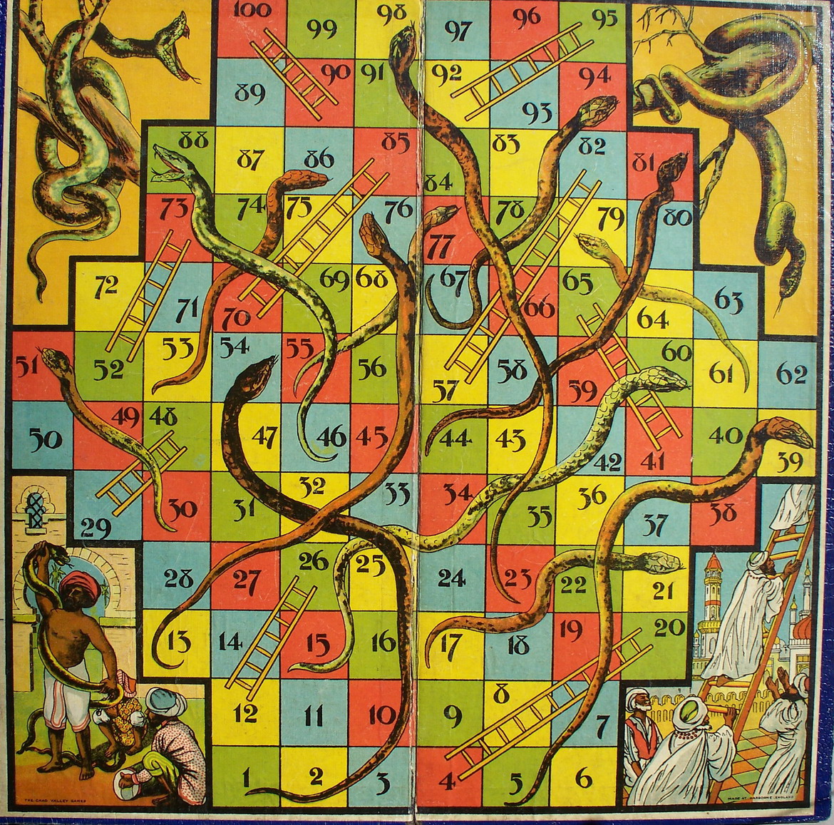
Some boards use interesting shapes and layouts:
Figure 4: Snakes and Ladders. E. Edelman. 2012. Digital collage. Retrieved from http://blog.retrocollage.com/eternal-collage-vice-virtue/
Figure 5: Snakes and Ladders board. 1920/30. Paper pasted on cardboard. 415x415.England-Harborne. Retrieved from http://www.giochidelloca.it/scheda_stampabile.php?id=883  

Some other interesting boards are those that substitute the snakes and ladders for other imagery.

Figure 6: Sledges and Toboggans.  (n.d.). Retrieved from http://sandradodd.com/game/snakesandladders

 
Figure 7: Cats Version. (n.d.) Retrieved from http://sandradodd.com/game/snakesandladders

This cat variation of the Snakes and Ladders board is interesting but isn't as clear as the original as to whether the ladder goes up or down.  It becomes more necessary for the player to pay attention to what is going on in the imagery.   


Monday 4 August 2014

Week 3

Pixies:

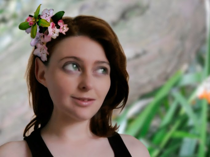
We took photographs of ourselves and used the liquify filters in Photoshop to manipulate them into pixies.  The main tools used in this technique are the bloat tool to make the eyes bigger, the pucker tool to make the chin smaller and the warp tool to reshape.

We tested these out first using photos of animals.  Here is the cat photo I manipulated.

Figure 1: Pixie Cat. Original Sourced from http://www.fanpop.com/clubs/cats/images/14749885/title/beautifull-cat-wallpaper 

Next I applied these techniques to my own photo.  To finish it off I added a surface blur and upped the saturation.

Figure 2: Pixie Manipulation

Figure 3: Pixie Manipulation 2

I decided to have another shot at the pixie photo manipulation.  This time I choose a photo that showed my ears so I could add Pixie-fy them too!

I took photos in the gardens around Invercargill, to add to the Pixie feel of the piece.

Figure 4: Second attempt at Pixie


This image is much prettier than my previous pixies.

Value Paintings

In class today we also looked at value paintings and atmospheric perspective. We had to paint a scene of a hot air balloon using these techniques.

Figure 5: Value Painting

Week 2: Painting into photos

In class we were given the task of painting boulders, based off the Moeraki Boulders, into a random beach photograph.

We used a custom tools set to try and make them look as natural as we could.  I particularly liked a colour shift brush which had an irregular shape as well as angle and colour jitter.

This is my first attempt which I painted in class.

Figure 1: Boulders on the beach

The positive feedback I received on this painting was:
  • The rocks have complementary colouration to the original photo
  • The perspective and sizing of the rocks 
  • Good addition of water splashes

Things that needed improvement:
  • The line work of the edges needs cleaning up
  • There isn't enough distinction between the furthest rocks
  • The shadows and highlights need a bit of work- the shadows are sharp but the highlights aren't so they are a bit unbalanced
  • The rocks are also very smooth and may need some cracks and scratches added.
I had another go at this at home with one of my own photos that I think was more successful.

Figure 2: Second Attempt


Week 1: The Board Game

Part of our assignment is the redesign of either a Snakes and Ladders or Chinese Checkers board.  I have had a few different concept ideas so far.

Snakes and Ladders could become a medieval themed siege with catapults and boiling oil taking the place of snakes and ladders and the goal to reach the castle.

Another idea I thought could be really nice visually is a space theme using comets and blackholes.  In this game you would ride the comets up and be sucked down squares through the blackholes (wormholes?).

For variations of Chinese Checkers it could be interesting to give the board a theme.  The pieces could become frogs that need to reach their own pond or other variations.

I created a basic draft exploring my comets and blackholes concept.  The comets and blackholes were rendered from Maya using the FumeFx plugin. 

Figure 1: Snake and Ladders Redesign Concept


Week 1: Snake

In class this week we learnt to create texture brushes in Illustrator by using a seamless texture or around 50x50 pixels.  We also experimented with rotate and repeat and the width tool.  The width tool was particularly useful for our homework, as we had to create a snake.  

The snakeskin texture used in this image was created by roseenglish on deviantart.

I used the pen tool to draw the shape of my snake and applied the snakeskin texture brush.  Then I used the width tool to manipulate the shape, resulting in the image below.

Figure 1:  Base Snake

The texture brush in Illustrator is useful but imperfect, as the textures do not quite line up properly.  
I saved this image then opened it up in Photoshop.  To fix the texture gaps I used the clone tool. 

Next I added detail to the snake with shadow and highlight layers, and finally gave the snake eyes and a tongue.  


Figure 2: Snake Design


Week 1: Labeled image

In class we had 30 minutes to create a digital painting of something which best represents ourself.  I really dislike these kind of briefs, and they always leave me struggling to find some way of representing this.

So I decided to work with this idea and explore the lack inspiration which I have been struggling with lately.  We then had to label the image, explaining details of our painting.  Honestly I feel very out of practise, and am not really happy with this image at all.

Figure 1: Labelled image