Wednesday, 22 October 2014

Sci fi and Fantasy Landscapes: Initial Renders

For my Sci Fi/ Fantasy Landcapes I started out working in Vue.  I went into this with a few loose ideas around different types of scenes I could create.

Some ideas I had were:
  • Based in a forest scene -Treehouses, a tree house city? magical forest, springs and waterfalls
  • A different planet- Ice or Crystal planet, Desert- like?
  • Space ships- high tech 
  • Windmills, blimps, surreal objects in an everyday setting.

When I actually started working in Vue I mostly just experimented with different ideas and types of environments, but had these initial ideas in the back of my mind.  These are some of my renders, and how I have thought to develop them.

Figure 1: Mountains or buildings?

Figure 2: Or maybe Islands?

Figures one and two show an experiment in using mountains and sculpting them to look inorganic.  If I was to continue any further with this idea I would use the more stylised lighting of Figure 2, and work on over painting areas of detail in Photoshop.

Figure 3: A surreal backdrop?
I really like this render, and I think it would be really well suited to be developed into a surreal or fantasy scene.  The fresh colours make me imagine brightly coloured blimps, or elephant shaped hot air balloons in the sky.  Perhaps a wooden windmill or bridge would work well in this scene.

I think for this scene I would draw inspiration from a brilliant artist, Naoto Hattori- who has some amazing surrealist painting; and possibly have a look at the art of some of the Studio Ghibli films.  


Figure 4: Sandy Structures

Figure 5: Cold planet

I created the interesting mountain in the background of Figure 4 and wondered how it would look in a different climate.  There are things I like about both these renders, but don't know how I would take them any further.  I like the simplicity of these scenes- to me they have a sense of isolation. Maybe I am happy enough with them as is.   


Figure 6: Floating Islands
Figure 7: Bubble
In the last two renders I wanted to experiment with a different take on the floating island- not the fantastical Avatar style floating islands, but something cold and mechanical.


Photo Manipulation: Cyborg or Android

I started out by taking a variety of photos of anything I saw nearby that could be used on my cyborg.

Figure 1: Assets
Then I chose one of the 3 non-blurry photos I had managed to take of myself while trying to do the pixie manipulation.  I chose this one as you can see most of my arms, giving me plenty of are to play with.
Figure 2: Me
I played around with some design roughs, but eventually decided to go with a clean, simple design.

Figure 3: Design roughs 1

Figure 4: Design Roughs 2

Figure 5: Design Roughs 3

Figure 6: Design Roughs 4

Figure 7: Final Design WIP

After finalising my design (I only ended up using one of my photos!) I started working on a background.   I wanted clean lines and slick surfaces to match my cyborg design so I used a combination of Maya and Photoshop, and create some subtle variations.

Figure 8: Cyborg Backgrounds

I think the two bottom variations are the nicest.  I like the cleanness of the first one but this is very similar to how I handled the Pixie manipulation.  In the second the background is still relatively subtle but feels overpowering towards the front. The line of the background also cuts straight across my shoulders- which to me looks a little weird.    Here they are in better quality:

Figure 9: White out background

Figure 10: Glow-y background


Photo Manipulation: Cyborg or Android, Starting out

For this task we need to manipulate a photo to create a cyborg or android image.  I really wanted to create a Cyborg Chicken for this task, but realised that I had lost my photos due to a hard drive crash.

Unfortunately I also didn't have the time to try to track down a chicken to photography, so was left with not much choice of subject- aside from myself!  I decided that I would need to use one of the self portrait photos I took earlier in the year.

In class we were shown a couple of tutorials online on cyborg photo manipulation.  To me though, saying these were cyborg was a bit of a misconception, as the finished images seemed more Android. Because of this I started off by thinking about Cyborgs and Androids, the differences between them and and what their purpose in society would be. 

I define Cyborgs as originally organic lifeforms which have been augmented by technology. Androids however I consider to be machines (robots) which are created to simulate the appearance of organic life.  

For both I can see a few reasons for each to have a purpose in society.  Cyborgs could be created either with the idea of replacing lost limbs or organs to preserve or improve life; or as a means of enhancing people or animals for a particular purpose- most likely for violent reasons such as soldier enhancement.  

Androids are created solely for a purpose by society.  Their purpose could definitely vary, and could be anything from providing companionship, to once again more violent purposes.

These are important as the purpose will significantly affect the design.  

I drew a few really quick design sketch ideas, while thinking about these points.
Figure 1: Initial design roughs

Next I began to track down some tutorials and speed paintings for inspiration.  Of those that I looked at my favourite final result was this image from Oliver Wetter.
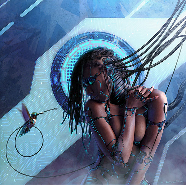
Figure 2: Android Legacy: Messenger II. Oliver Wetter. (n.d.). Digital Art. Retrieved from http://www.photoshoplady.com/tutorial/making-a-robotic-effect-for-a-human/6003   
What I like about it is how well the artist works with the form.  In many of the other examples the artists sometimes attempt to follow the form of the body, but end up not being as successful.  This work is a bit different in technique as well, as rather then using the pen tool like most other examples the design is hand drawn.  I also liked the incorporation of the hummingbird.   


This is the first example I found using a photo of a man. 

Puzzle: Final


My Completed Puzzle! Yay!

Puzzle: Development

I decided that my composition was missing something so started exploring some variations.


Playing with the scale and position of the Dragon and the Sheep slightly also helped me to finalise my composition.

With this locked down I began cleaning up the line-work and painting my puzzle.

Cleaning up the dragon

Figuring out tones through blocking
Colour Blocking
Adding Details


Puzzle Inspiration: Illustrators

For my puzzle I want to use a more painterly style than in my previous work.  I want to stay away from using photo textures and concentrate on presenting the scene through it's composition and bright colours.  I want to use quite bold colours in this design as it is intended to be family friendly, fun, and a little quirky

I decided to do some research into different Illustrators for inspiration, and managed to find some with a style I feel complements my own and gives a similar feel to what I intend for my puzzle.    

Izzy Bean: 

These illustrations by Izzy Bean make use a quite bright colours, but also have a softer look do to the lack of dark outlines seen in some of her other work.  I feel that this also contributes to the more painterly look of these particular images.  The technique of using the same colour in a darker shade for outlines can also be seen in places in her work- this is a technique that is also seen in Nickelodeon animations, so is also popular in the animation industry for children's shows. 

Izzy Bean's colouring style- especially in figures 1 and 3, gives a looser and more painterly look to the image.  One thing I do notice about these images is that they seem a little flat.  In these images the focus is clearly on the characters, with less emphasis on backgrounds or environments.  This is exaggerated by the images' softness- as they do not have a lot of tone contrast.

These are definitely images that I can draw inspiration from.

Freddie the Bear
Figure 1: Freddie the Bear. I, Bean. (n.d.). Retrieved from http://www.childrensillustrators.com/illustrator-details/IzzyBean/id=1896/slideshow/pag=10/
Autumn bears
Figure 2: Autumn Bears. I, Bean. (n.d.). Retrieved from http://www.childrensillustrators.com/illustrator-details/IzzyBean/id=1896/slideshow/pag=38/

The Selfish Shellfish
Figure 3: The Selfish Shellfish. I, Bean. (n.d.). Retrieved from http://www.childrensillustrators.com/illustrator-details/IzzyBean/id=1896/slideshow/pag=1/


Kristin Varner:

Kristin Varner's work is decidedly quirky, with bright colours.    Kristin's work makes use of simple shapes to create characters which have a lot of personality.   The backgrounds are often slightly of kilter, sometimes with intentionally skewed perspective, but they have quite a lot of depth to them.   Most works tend to have a slight texture to them.

Let's Camp!
Figure 4: Let's Camp!. K, Varner. (n.d.). Retrieved from http://www.childrensillustrators.com/illustrator-details/kristinvarner/id=1451/slideshow/pag=1/

MacMillan/McGraw Hill
Figure 5: MacMillian/ MacGraw Hill. K, Varner. (n.d.). Retrieved from http://www.childrensillustrators.com/illustrator-details/kristinvarner/id=1451/slideshow/pag=29/
Harry the Sofa King
Figure 6: Harry the Sofa King. K, Varner. (n.d.). Retrieved from http://www.childrensillustrators.com/illustrator-details/kristinvarner/id=1451/slideshow/pag=27/ 


Gill Guile

I love the watercolour look of these images by Gill Guile.  The expressive characters and colour palettes of these images really give then that extra something.
elephant, parrot and monkey
Figure 7: elephant, parrot and monkey. G, Guile. (n.d.). Retrieved from http://www.childrensillustrators.com/illustrator-details/Guile/id=1503/slideshow/pag=9/


SHHHHHH!
Figure 8: Shhhhhh!. G, Guile. (n.d.). Retrieved from http://www.childrensillustrators.com/illustrator-details/Guile/id=1503/slideshow/pag=23/


The colours of the dragon in figure 8 are really similar to what I had planned to do for my dragon.


Puzzle: Draft and Research

After some thought about my puzzle ideas I decided that I would go with my first design concept- the dragon relaxing with a cup of tea.

While I really liked some of the other concepts I felt that this was the best fit for the brief and also quite a fun idea.

I began to experiment with different background elements and, because I liked them so much, decided to incorporate my sheep into the background.

Figure 1: Puzzle Concept

I decided it was a good time to experiment with some very rough colour, and try to create a mood.  I experimented with quite bright colours as I felt these would best suit the mood of the scene.

Figure 2: Colour Concept 1

Before finalising my design and linework I began to do some research to further expand on the idea. I left this until after deciding on my initial concept as I didn't want my ideas to be too influenced during the early stages of development.

Illustrations with Tea Parties:
The Mad Hatters Tea Party - matthews, fantasy, rodney, mad, teaparty
Figure 3: The Mad Hatters Tea Party. R, Matthews.  (n.d.). Retrieved from http://abstract.desktopnexus.com/wallpaper/255931/
kate greenaway illustration, vintage tea party, victorian girls dress, old fashioned garden party image, child tea party printable
Figure 4: Vintage Tea Party. K, Greenaway. n.d. Retrieved from http://olddesignshop.com/2013/10/vintage-tea-party-kate-greenaway-illustration/


Tea party in nature
Figure 5: Tea Party In Nature. Tjapa2007. (n.d.).  Retrieved from http://www.dreamstime.com/stock-image-tea-party-nature-fantasy-scene-computer-graphics-resting-place-image33381431


Cafes:

As reference I gathered some imagery of outdoor cafes.

Figure 6: Folsom Historic District. California Home Network. 2005. Retrieved from http://folsom.calhomenet.com/historical.htm

This image (figure 6) has made me decide that I definitely do want to go with red for the umbrellas - just as I originally blocked in.  I like the warmth the colour palette of this photo gives.  However I want the cafe to be in a more garden like setting, but one a bit more groomed then the image below (Figure 7).  Of these photo's I had to include Figure 9 for its beautiful fantastical look and lighting, despite that it doesn't really match the feel I am after. 


Figure 7: Amani's garden cafe.  2011. Retrieved from http://amaniyajuunews.wordpress.com/2011/08/11/celebrating-15-years-of-amani-ya-juu-outreach-programs/
Figure 8:  Italy Cafe.  (n.d.) Retrieved from http://shesamaineiac.com/tag/travel/


Naples Cafe in the Evening
Figure 9: Naples Cafe in the Evening. T, Ratcliff. 2006. Retrieved from http://www.stuckincustoms.com/2006/11/23/naples-cafe-in-the-evening/